

Mugest
The gesture interface is to use different gestures to control different functions of the app without touching the screen of the electronic product. It's used when people need to use an app or software but don't have a free hand or can't reach the screen. My project is gesture-controlled music software. When the user wants to listen to music when it is inconvenient to touch the screen, such as cooking, washing dishes, or washing clothes, the music software can be controlled by gestures.
Smoke and mirror is the spatial analysis utilizing film scenes and literature, and animation artifacts are the digital and physical outgrowth of rapid prototyping (laser cutting), digital fabrication techniques, and model making. In my project, the "smoke and mirror" used is the use of video clips, and the gestures, background, and interface clips are individually clipped together to show the user the complete use process.
Videos of final design

All Videos
Design Process
1
Research
This exercise is my observation of the intentional and unintentional gestures of my friends and myself. The purpose of this exercise is to find gestures that users can understand and understand to put into my project.


This research led me to discover that there are two types of gestures, one intentional and the other unintentional. Intentional gestures are generally seen in the growth environment and experience of others or learned in videos or books. And unintentional gestures are gestures made without intending to do so because of different situations and moods.
2
Representing Gestures

3
Echo and Semantic Feedback
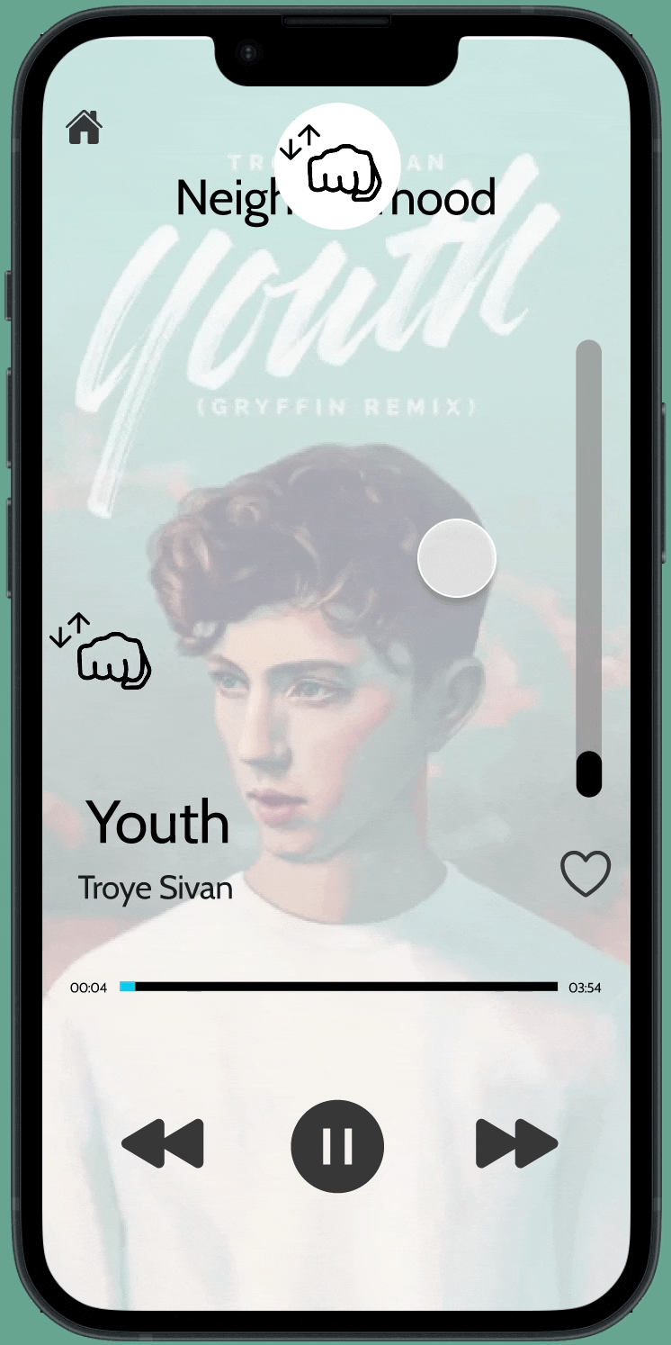
Prioritize roadmaps and align resources based on centralized collection of user feedback. Build what customers want most with complete product demand intelligence. Customer feedback is a valuable and great creative resource to ensure my product innovations meet their current and future needs. Clients can provide me with a complete analysis of your products and services and help me understand their strengths and weaknesses. Feedback on gestural interfaces allows me to better understand and figure out the most appropriate gestures for a project, and makes the finished product more accessible to users. Echo and Semantic Feedback is a way to pick out a few features and use Figma to provide echo and semantic feedback to your system for prototyping. In my project, I chose the music player prompt, and my functions are selecting songs, "stop" and "play", "volume up" and "volume down", adding or removing songs from favorite list. Their gestures are all paired.
4
User Flow Diagramming
A user flow (or user flow diagram or flowchart) is a diagram that describes the path a prototype user takes to complete a task on a website, app, or kiosk. A user flow describes the journey a user might take from the moment they open an app, land on the home page of a website, or enter a store offering a service. A user flow describes the steps and choices a user takes to successfully achieve a goal. A user flowchart can contain many different paths, illustrating how different users can take different routes based on their choices. Planning the user flow of potential users is a useful step in designing an interactive experience. It provides a framework for a series of interactions that occur over time. The user flow will also help you decide which buttons and functions need to be displayed on the kiosk screen. By referencing your user flow, you can see where the user is in the flow, what happens next, and what no longer needs to be on the screen.
The components of the user flow are:
-
The rectangular box is used to represent what the user does by interacting with the application/service.
-
The diamond-shaped box is used to indicate user selection. They are usually connected by three wires: input, YES output and NO output.
-
A circle or "diamond" shaped box is used to indicate the start or end of a task.
-
Sometimes the user may have more than one choice. This can be used to list three different payment methods and then proceed on three different payment journeys.
TASK 1 : Return to the onboarding part
rewind to onboarding to relearn at any time if they forget the functions and actions of the gestures.

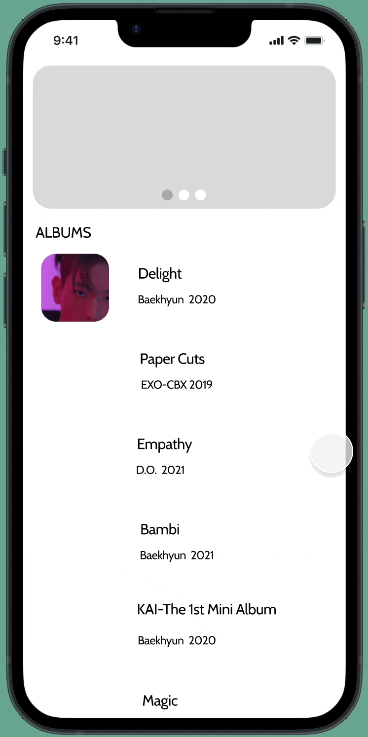
TASK 2 :Choose a track to Listen to
Select an album from a list of albums and then select a specific track from an album.

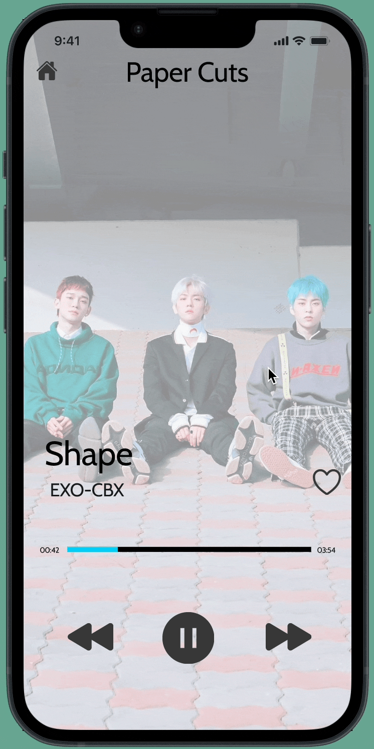
TASK 3 :Control the track
Stop and Play the music from an already selected track, then choose to Play the next / previous song.

TASK 4 :Set the Volume of the Track and like the song when you listen
Increase and decrease the volume. Set the volume at the desired level, and move in or move out a song to/from the likelist

5
UI Patterns
Design patterns are repeatable solutions to recurring design problems. I need to find out the easiest way a user can interact with your website or application. Using an existing model helps eliminate the pain point of users having to repeat basic tasks and running out of time and patience, they already know what to expect and how to interact. UI patterns are different from UX patterns. UX (User Experience) patterns refer to the experience or user journey that a user goes through while using an application. For example, "register", "login", "login" and "logout" all use familiar UX patterns. The UI pattern focuses on the layout and design of the visual interface.
UI Patterns for Task Flow No.1
UI Patterns for Task Flow No.2


UI Patterns for Task Flow No.3
UI Patterns for Task Flow No.4


6
Wireframes
Wireframes are schematic diagrams, blueprints, that help you and your programmers and designers think about and communicate the structure of the software or website you're building. The same screen can be built in many different ways, but there are only a few that will properly convey your message and result in an easy-to-use software or website. Determining a good interface structure is probably the most important part of software design. Wireframes help convey your message Wireframes help you define your interface Wireframes lead to easy-to-use software and websites Wireframes save you time and tweaking work later Wireframes often have a deliberate lo-fi look and feel.
1. The wireframe makes it clear that this is not the final design
No one should mistake a wireframe for the final look of an application. Low fidelity and very little color forces you to focus on structure rather than detail. After the structure is finalized, there will be a lot of time for visual design.
2. Wireframes convey "it's all under discussion"
A rough feel encourages discussion. We call it the appearance that no one is afraid of criticism. Wireframes are pretty quick to make, so don't be shy about giving feedback! It may only take a few minutes to make each screen; don't worry, their authors won't mind redoing them from scratch. What matters at this point is ultimate ease of use, so going through a few iterations is normal and expected.
3. Wireframes make it clear that no code has been written yet
If your customers or stakeholders receive some screens that look like screenshots of the final application, rather than wireframes, they might assume that all the code behind those screenshots has already been written. Usually this is not the case. Wireframes have no such dangers.
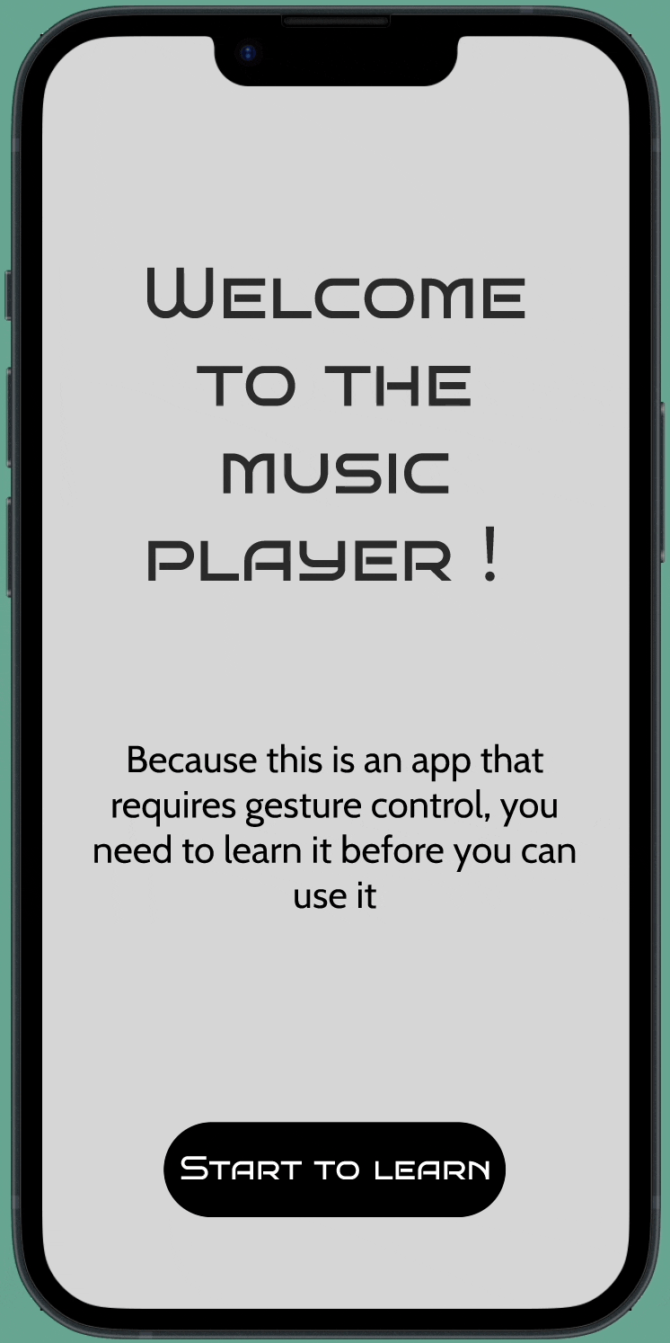
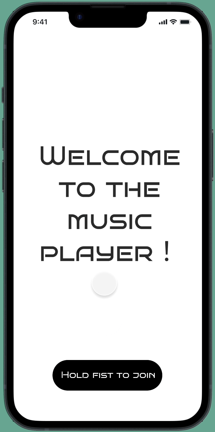
nboarding
The onboarding training is to show the user gestures with animation, explain the function of the gesture, and let the user try to control the function.
ask 1
The first task flow is that the user joins the app, and can rewind to onboarding to relearn at any time if they forget the functions and actions of the gestures.
o
T
ask 2
The second task flow is to select specific albums and music to play through gestures.
T
ask 4
The fourth task process is to use gestures to control the volume of music playback, add songs to the favorite list or remove songs from the favorite list.
T
ask 3
T
The third task flow is to use gestures to pause and replay songs, and play the previous and next songs.
7
User Testing with a User Testing Script
Together, prototyping and testing add enormous value to the design process. Not only does user testing help you stay user-centric; it also makes good business sense. By testing your ideas early and often, you can identify design flaws and usability issues before bringing your product to market.

8


User Test - Top Ten Takeaways
What I learned about my prototype, what worked well? What needs to change?
1. In the teaching part, you can write clearly whether the swipe up and down in the sliding list part is scroll one by one or keep scroll.
2. Correct some wrong spells.
3. The white text on the lyrics interface is more difficult to read. You can change the color of the text or change the background color to be darker.
4. In the teaching animation, the animation of stopping the song (from opening the palm to making a fist) and playing the song (opening the palm from the fist) is more clearly expressed as two different animations.
5. Only the logo on the top of the mobile phone screen is required to indicate the gesture, and the gesture on the left is not required.
6. Darken the color of some icons to make them more obvious in the picture.
7. Increase the fluency of animation.
8. Add more functions to make the page look more complete.
9. Conduct more user tests to improve my page.
10. Explain in detail the parts that some users are confused about.
Style Guides
A style guide is **a document that contains design guidelines for each repeatedly used design element**, such as visual identity elements, icons, interface components, and their states, headings, etc.
A style guide is essential **to keep your brand identity consistent, recognizable, and ownable**
, even as several different people develop content for your brand. Since a style guide defines the guidelines for maintaining a brand's identity, it's important to spend the time and resources to get it right.
my style guides the process
Through different color representations, find suitable colors on the website and combine them, and put them on the wireframe for different attempts. Finally, find the right color and font.
9


Green Screen Filmmaking
A green screen allows film production to remain within a sound stage but depict disparate locations and sequences. There are many, many uses for this technique in Hollywood filmmaking, many of them to do with special effects.
Shooting with a green screen involves filming a person or adding visual effects in front of a solid color. Then, by digitally removing or “keying out” that color, you can drop that scene onto the background of your choice in post-production. Removing the colored background is also referred to as “chroma keying.”
I first borrowed the school's green screen background and set up a tripod for the mobile phone in front. Find the right angle and size, lock the screen's light source, and take a shot of the gesture. "Smoke and Mirrors" has my screen recording, my background image and my hands.
Conclusion
Through this project, I learned some gestures that I may not have used, the understanding and application of gestures. Learned the application of software AE, and learned to use a green screen to shoot. I learned to record the animation of the interface I made and put it in the background of the existing mobile phone. I think my final design is okay, not perfect, but the process is complete and clear. I think its advantage lies in the completeness of the entire video, the matching degree of gestures and functions, and the animation of gestures used for teaching in the onboarding part. Its weakness is that the speed of the gesture in the video is a bit strange because the gesture needs to match the speed of the interface. The overall color makes some buttons and text on the interface less prominent. If I had more time, I might re-record the gesture so that the speed of the gesture and the interface are consistent, and improve the color of some elements of the interface.